Slough Website Design
We create stunning websites that deliver the goals of ambitious businesses in Slough.
If you are an SME, start-up or marketing manager looking for web designers near Slough, look no further than your local one-stop digital agency Immedia Creative. For over 15 years we’ve been designing, developing and optimising websites that generate business growth.
We make websites that convert
Contact us
to find out how
Please feel free to call our office 01753 206006
An Experienced Team On Your Side
We have a wealth of experience in designing, building and optimising websites to deliver the business you want. That’s because our team of marketeers, designers and developers have been around for a while and properly understand business and marketing.

Nicola
Strategy

Richard
Design

Chris
Web Developer

Cameron
Web Developer
Based Near Slough
Based in Windsor, we love to work with local clients. The majority of our clients are close by in the Maidenhead, Slough and Windsor area and quite frankly we prefer it that way. We like nothing better than meeting regularly to discuss business ideas so we can deliver solutions that are finely tuned to delivering your goals and aspirations.
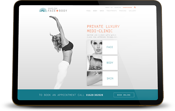
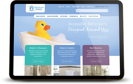
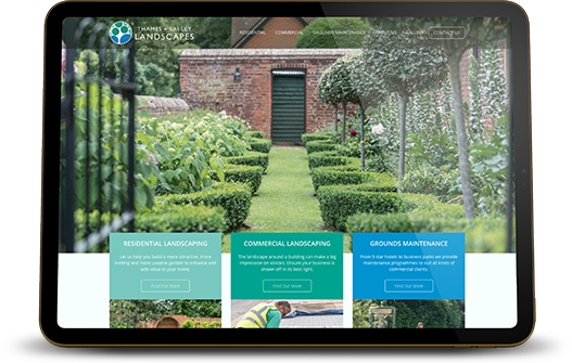
A Few Of Our Web Designs For Businesses Near Slough
When you work with Immedia Creative you can rest assured your website and marketing is in safe hands. Over the years we’ve created brands, designed successful digital campaigns and built beautiful website for clients in Slough and the surrounding areas (Langley, Burnham, Taplow, Iver and Colnbrook).
Want a website that delivers leads and sales?
We Answer Your Web Design FAQS
These days, your website is your shop window, and often also a key member of your sales team. It’s where everyone goes to check you out, and the days of “just having a web presence” through a stand-alone website are long gone.
To be an effective marketing and selling tool, your website must now integrate with other digital media and marketing channels (such as social media sites, blogs, video and image sharing sites, shopping and auction sites, forums…the list goes on).
It must load fast and provide a useful, intuitive web experience.
What’s more it’s essential that your website is “mobile friendly” to reach the vast number of people now using mobile devices to browse and buy online. All our sites are designed to look great and work well no matter what type of device being use to view it.
At Immedia Creative, we have an in-house team of web developers with many years’ experience in designing functional websites with the “wow” factor.
Effective and functional website design is no simple task. First of all, we want to know about your business, your customers and what they need from a new website.
We then have to create something with instant kerb-appeal. This means that the site has to be eye-catching and visually appealing. Next, we have to make the web design and layout interesting or intriguing, encouraging visitors to stay on and explore your site. We make it quick and easy for them to journey around your website to find what it is they are looking for.
We help visitors decide to do business with you and take some form of action. Whether that’s buying a product or booking a place on an event. Completing an enquiry form, contacting you directly by phone, email, text, or live chat. Signing-up for a competition or newsletter, liking you on Facebook or following you on Twitter.
A responsive website is one that automatically re-configures its layout based on the size and resolution of the viewer’s screen. So the website will appear completely differently on a desktop/laptop PC, on a Tablet, and on a Smartphone. This is because each “item” on the website is defined as a “block”, and the blocks are they given rules on how they should act depending on the size of the screen. A well-designed and built responsive website will switch menus and navigation styles, change image resolutions, re-size text, and switch on/off specific functions and features depending on the viewing platform.
We also have to consider than unlike a brochure, people using your website won’t usually start at the first page and finish at the last page. They can enter your website on any page, and will then move around the website in an un-constrained way. This adds yet another layer of complexity to the website design, meaning we need to make sure that no matter what page they land on, they can see the whole site structure, and we can still get your key values and messages across.
We have designed and build websites using many popular web development platforms, but in the last couple of years we have largely focused on WordPress, the world’s most popular open-source platform.

