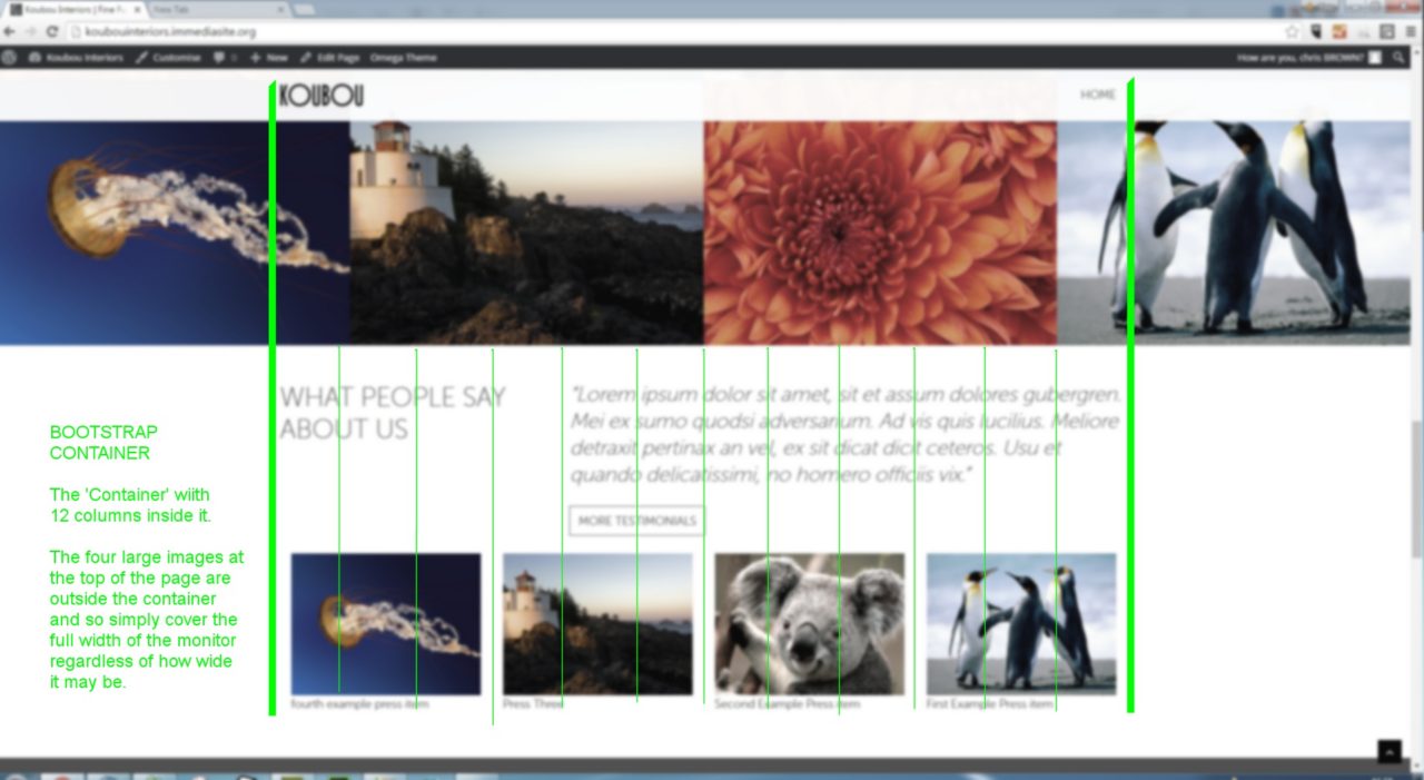
Sometimes, a picture really is worth a thousand words. I was trying to explain to a designer about the bootstrap container. When I showed them this screengrab, overlayed with green lines to show the container and individual 12 column layout, they got it immediately. So, i thought I had better share the screengrab with the rest of the planet.

The four images at the bottom each take up 3 columns. The white space between them is caused by the default bootstrap column margin of 15 pixels. Designers need to know about that when designing for a bootstrap site. Yes, the width of the margins can be overridden, but then we need to think about the implications to responsiveness.